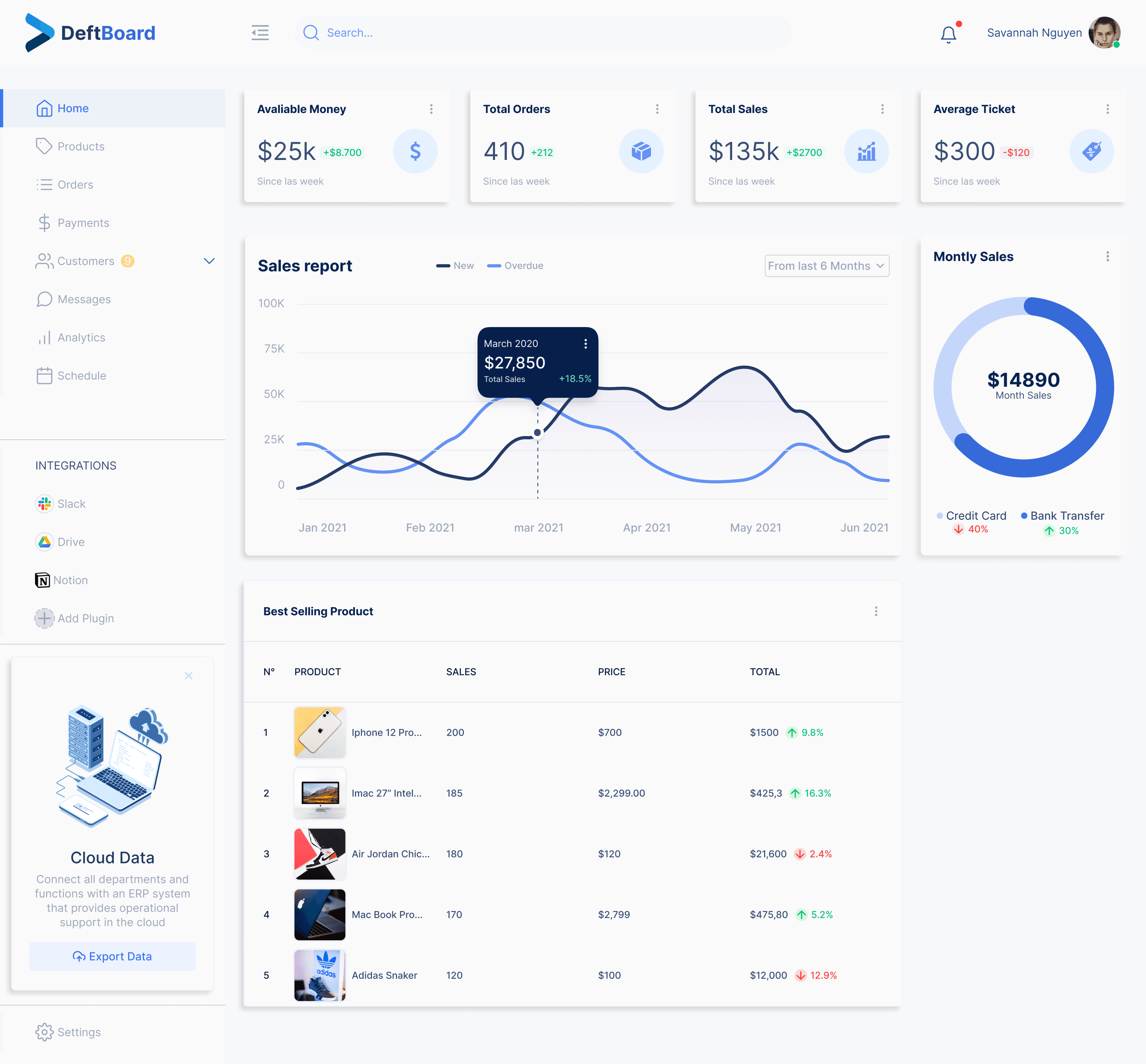
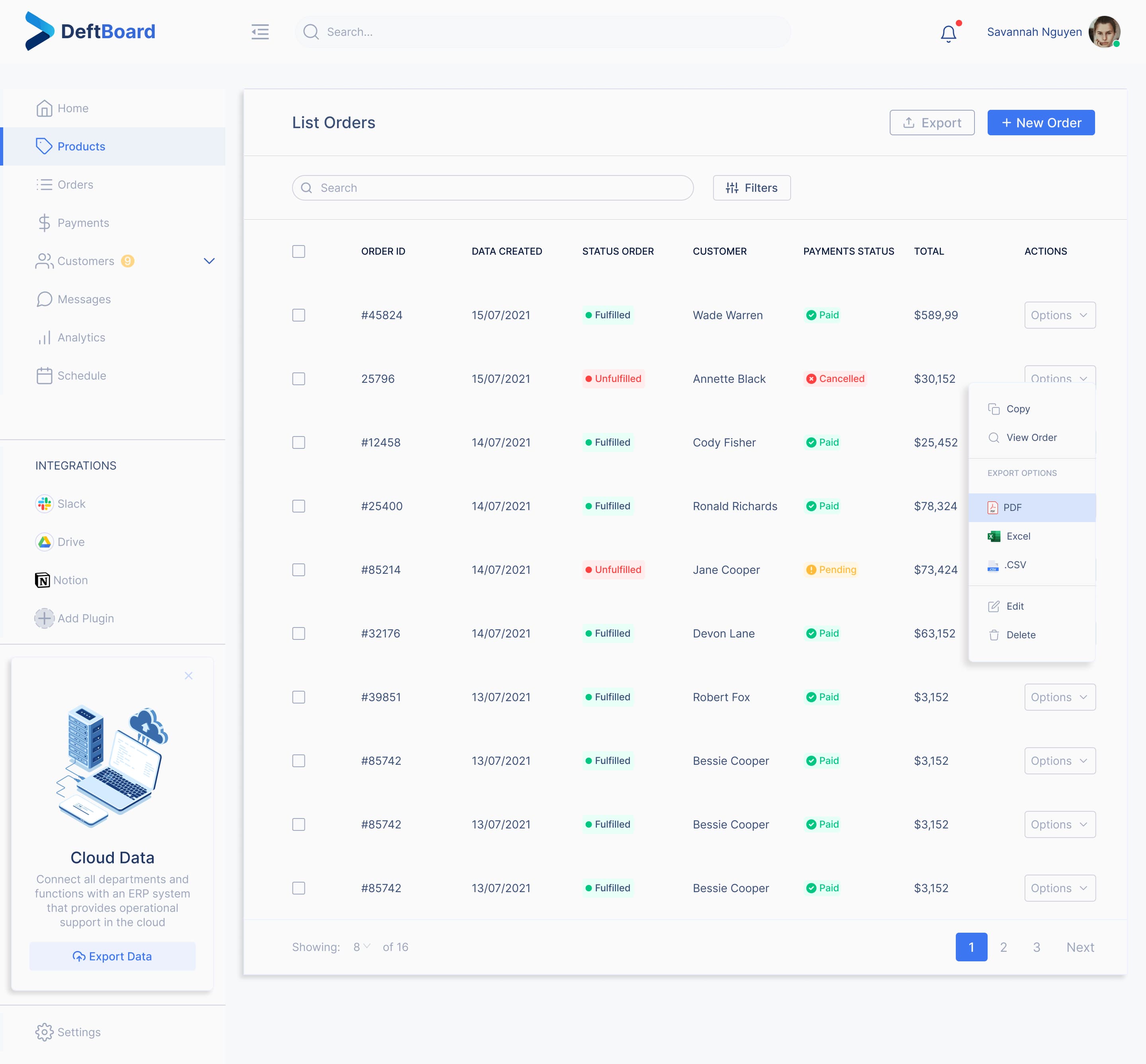
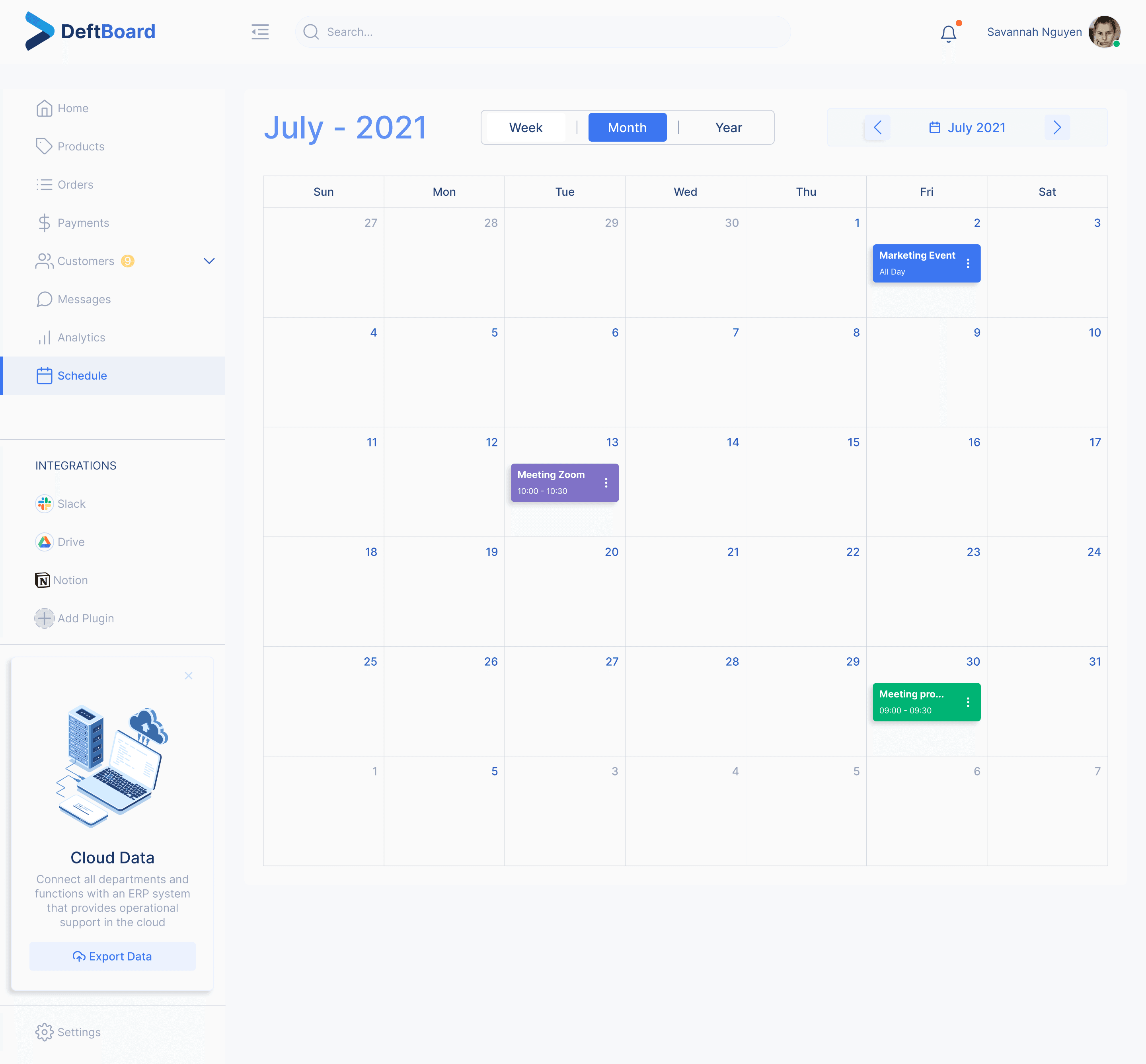
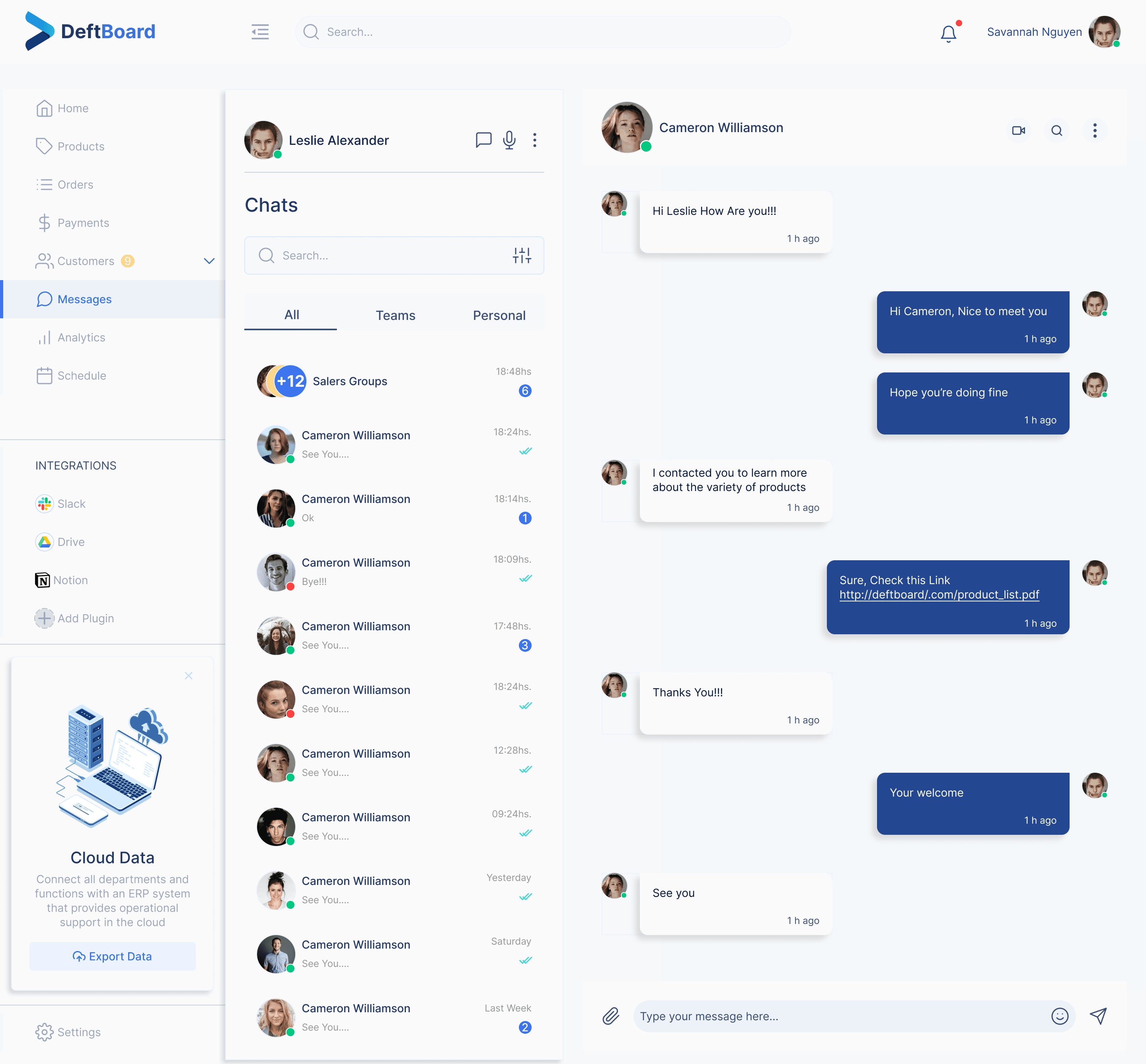
Dashboard Design System
A Figma library for dashboard products: 49 component sets, 817 variants and 558 icons, published to the Figma Community and used 1,600 times.
role
Design System Designer
type
Personal project
year
2021
tools
Figma
49
Component sets
817
Variants
558
Icons
137
Styles
4
Screens
A dashboard system built before the tools caught up
This system was built in 2021 — before Figma Variables, and before boolean and instance-swap component properties existed. Every token in it is a shared style, and every component property is a variant axis. That constraint is the context for everything below: choices that look verbose today were the only way to express them at the time.
Tokens, before tokens had a name in Figma
The file carries 137 shared styles: 55 paint, 73 text, 4 effect and 5 grid. Names are reproduced exactly as they ship — spacing, capitalisation and typos included — because that is what a reader downloading the file will see in their own style panel.
55 paint styles across 10 ramps
Primary
Primary/100
#ECF1FE
Primary/200
#D8E4FC
Primary/300
#C5D6FB
Primary/400
#6391F4
Primary/500 (Base)
#3C76F1
Primary/600
#366AD9
Primary/700
#305EC1
Primary/800
#2A53A9
Primary/900
#244791
Secondary
Secondary/100
#CED3DD
Secondary/200
#9BA6BC
Secondary/300
#394E75
Secondary/400
#213864
Secondary/500 (Base)
#082253
Secondary/600
#071F4B
Secondary/700
#061B42
Secondary/800
#06183A
Secondary/900
#04112A
Tertiary
Tertiary/100
#E7FAFA
Tertiary/200
#CFF5F4
Tertiary/300
#58DDD9
Tertiary/400
#40D9D4
Tertiary/500 (Base)
#10CFC9
Tertiary/600
#0EBAB5
Tertiary/700
#0DA6A1
Tertiary/800
#0B918D
Tertiary/900
#0A7C79
Alert / Success
Alert/Succes/100
#66DDB3
Alert/Succes/500 (Base)
#00C781
Alert/Succes/600
#00B374
Alert / Warning
Alert / Warning / 100
#FFD688
Alert / Warning / 500 (Base)
#FFBB38
Alert / Warning / 600
#E6A832
Alert / Danger
Alert / Danger/ 100
#FF8C8C
Alert / Danger/ 500 (Base)
#FF4040
Alert / Danger/ 700
#CC3333
Background
Background/Primary-Bg
#F5F8FA
Background / Secondary-Bg
#EDF1F8
Background / Tertiary
#F7F8FA
Grey
Grey / Grey-100
#FAFAFA
Grey / Grey-200
#E1E1E1
Grey / Grey-300
#C8C8C8
Grey / Grey-400
#AFAFAF
Grey / Grey-500
#969696
Grey / Grey-600
#4B4B4B
Grey / Grey-700
#323232
Grey / Grey-800
#191919
Grey / Grey-900
#000000
Opacity
Opacity / Opacity-05
rgba(0, 0, 0, 0.05)
Opacity / Opacity-10
rgba(0, 0, 0, 0.1)
Opacity / Opacity-20
rgba(0, 0, 0, 0.05)
Stored at 0.05, same as Opacity-05, despite the name.
Opacity / Opacity-40
rgba(0, 0, 0, 0.4)
Opacity / Opacity-80
rgba(0, 0, 0, 0.8)
Black And White
Black And White/Black
#000000
Black And White / White
#FFFFFF
There is no numeric spacing scale in this file. Layout is documented the way the system actually expresses it: six breakpoints and four responsive column grids.
X-Small
<576px
Documented on a 480px frame
Small
≥576px
Documented on a 576px frame
Medium
≥768px
Documented on a 768px frame
Large
≥992px
Documented on a 992px frame
Extra Large
≥1200px
Documented on a 1200px frame
Extra extra large
≥1400px
Documented on a 1440px frame
Phone · 0px - 599px
4 columns
16px margins & gutters
Small Tablet · 600px - 719px (Small Tablet)
8 columns
16px margins & gutters
Large Tablet · 720px - 839 (large tablet)
8 columns
24px margins & gutters
Desktop · 720px - 1920 +
12 columns
32px margins & gutters
The type scale below is the one the file prints next to each specimen — the intended scale. What is actually bound diverges from it in half the steps: 46 of the 73 text styles carry a line-height of exactly 20px, from 12px body copy up to 48px headings.
Desktop · Heading · H1
48 / 56 px
3 rem · 3.5 rem line-height
Desktop · Heading · H2
39 / 48 px
2.4 rem · 3 rem line-height
Desktop · Heading · H3
31 / 40 px
1.9 rem · 2.5 rem line-height
Desktop · Heading · H4
24 / 32 px
1.5 rem · 2 rem line-height
Desktop · Heading · H5
20 / 28 px
1.25 rem · 1.75 rem line-height
Desktop · Heading · H6
16 / 28 px
1 rem · 1.75 rem line-height
Desktop · Subtitle · Subtitle 1
26 / 36 px
1.65 rem · 2.25 rem line-height
Desktop · Subtitle · Subtitle 2
24 / 32 px
1.5 rem · 2 rem line-height
Desktop · Subtitle · Subtitle 3
20 / 28 px
1.25 rem · 1.75 rem line-height
Desktop · Body · Body 1
12 / 20 px
0.8 rem · 1.25 rem line-height
Desktop · Body · Body 2
16 / 28 px
1 rem · 1.75 rem line-height
Desktop · Body · Body 3
14 / 22 px
0.85 rem · 1.375 rem line-height
Desktop · Body · Body 4
12 / 20 px
0.8 rem · 1.25 rem line-height
Mobile · Heading · H1
31 / 40 px
1.9 rem · 2.5 rem line-height
Mobile · Heading · H2
24 / 32 px
1.5 rem · 2 rem line-height
Mobile · Heading · H3
20 / 28 px
1.25 rem · 1.75 rem line-height
Mobile · Heading · H4
16 / 28 px
1 rem · 1.75 rem line-height
Mobile · Subtitle · Subtitle 1
20 / 28 px
1.25 rem · 1.75 rem line-height
Mobile · Subtitle · Subtitle 2
16 / 24 px
1 rem · 1.5 rem line-height
Mobile · Body · Body 1
16 / 28 px
1 rem · 1.75 rem line-height
Mobile · Body · Body 2
14 / 22 px
0.85 rem · 1.375 rem line-height
Mobile · Body · Body 3
12 / 20 px
0.8 rem · 1.25 rem line-height
Common · Overline · Overline
18 / 20 px
0.75 rem · 1.25 rem line-height
Common · Caption · Caption
12 / 20 px
0.75 rem · 1.25 rem line-height
Common · Button · Large Button
16 / 24 px
1 rem · 1.5 rem line-height
Common · Button · Small Button
14 px
0.875 rem
51,638
Views
2,449
Appreciations
3,131
Saves
1.6k
Figma Community uses
Published August 2021. Since then: 51,638 views, 2,449 appreciations, 3,131 saves on Behance — and 1.6k uses on Figma Community.
The saves matter more than the likes. An appreciation means someone thought it looked good. A save means they took it into their own account to work with. Three thousand people did that.
I built this to learn Figma. It became infrastructure for strangers.
The flaws I see now aren't the aesthetic ones. They're the ones that only surface when someone actually uses the file.
Typography documents two numbers and explains neither
Each step shows something like “24px 32px”. In June 2024, three years after publishing, someone asked me what the second number meant. It's line height — but nothing in the file says so. Worse: 46 of the 73 text styles carry a bound line height of 20px, from 12px captions to 48px headings. The sheet documents one thing; the styles apply another.
Forty-two instances point to components that no longer exist
Anyone who duplicates it sees screens assembled from parts they can't find.
The icons are two libraries wearing one name
The 558 icons span five sets, and the two main ones don't line up. Outline uses an fi: prefix, solid doesn't. Normalize the names and only 81 appear in both sets — 200 are outline-only, 150 solid-only. You can't swap between styles for most of the icons, because the pair was never built.
None of these are visible while building. All of them break the moment someone else picks it up. That's the part a system can only teach you when it has users — which is why this file taught me more than the ones nobody downloaded.
Forty-nine sets, eight hundred and seventeen variants
None of the 49 sets uses a boolean or an instance-swap property, because neither existed in 2021. Everything that reads as a toggle is a variant axis with True/False options, and every optional element is another row in the matrix. Reading the inventory with that in mind is what makes the variant counts legible.
49 component sets · 817 variants · every property a variant axis
Component set
Variants
Instances
Default-button
135 variants
94 instances
Rounded-button
135 variants
0 instances
soft-button
54 variants
40 instances
Only-icon-default
45 variants
0 instances
only Icon rounded
45 variants
0 instances
Avatars
32 variants
33 instances
Deault-button
20 variants
0 instances
Rounded-status-button
20 variants
1 instances
Status-number
20 variants
0 instances
Status-number
20 variants
0 instances
Soft Pills Badges
18 variants
105 instances
Solid Pills Badges
18 variants
0 instances
Soft Badges
18 variants
19 instances
Solid Badges
18 variants
0 instances
Sidebar
16 variants
5 instances
Input
15 variants
18 instances
Soft Counter Pills
12 variants
0 instances
Soft Counter
12 variants
0 instances
Counter Pills
12 variants
0 instances
Solid Counter
12 variants
0 instances
loading-buttons
9 variants
0 instances
Feedback Form
9 variants
0 instances
Icon Badge Solid
9 variants
31 instances
Radio
8 variants
0 instances
Checkbox
8 variants
59 instances
Status Avatar
8 variants
34 instances
Alert
8 variants
0 instances
Component 1
8 variants
13 instances
Component
7 variants
1 instances
Text Area
6 variants
1 instances
Toggle Standar
6 variants
0 instances
Icon Badge
6 variants
15 instances
Drop-down-button
5 variants
0 instances
Tooltip / Light / Default
4 variants
0 instances
Tooltip / Dark / Default
4 variants
0 instances
Tooltip / Dark / Analytics
4 variants
0 instances
Tooltip / Light / Analytics
4 variants
0 instances
Mobile Toggle
3 variants
0 instances
Slider Control
3 variants
0 instances
Slider Control Range
3 variants
0 instances
Radio Button
2 variants
4 instances
Divider
2 variants
59 instances
Conversations chat
2 variants
10 instances
Component 2
2 variants
8 instances
Button Navigation
2 variants
119 instances
Button Navigation Contracted
2 variants
72 instances
Drop down Navigation
2 variants
13 instances
Setting
2 variants
0 instances
Top-Bar
2 variants
7 instances
Nine properties, five hundred and twelve combinations, sixteen built
Sidebar — variant model
512
Full matrix
16
Variants built
9 properties
contracted
Home
Products
Orders
Payments
Customers
Messages
Analytics
Schedule
Nine variant properties: one collapse state plus one True/False axis per menu item. The complete cartesian product is 512 combinations. 16 exist — the collapse state times the eight items, one active at a time.
The Sidebar does not draw its own rows. It composes Button Navigation — a two-variant set with a single Active axis, and the most-instanced component in the file at 119 uses. The atomic hierarchy declared in the page list is load-bearing, not just naming.
Three sets that show the rules being applied
Default-button
135 variants of a possible 180: type × filled/outline × three sizes × five states × three icon positions. Every combination exists except secondary outline, whose 45 are absent. The five states cover the full interaction set — default, hover, focus, active, disabled.
Soft Pills Badges
The most consumed set in the file: 105 instances, 73 of them inside the final screens. Its nine colour options map one to one onto the paint ramps — Primary, Secondary, Tertiary, Succes, Warning, Danger, Information, Light, Dark.
Avatars
32 variants from type × shape × eight sizes. It replaced two earlier sets, Photo Avatar and Initials Avatar, by folding the distinction into a Type axis instead of leaving it as two separate components.
The Avatars migration was never finished
Photo Avatar and Initials Avatar were consolidated into one 32-variant set, but neither original was removed from the file — both still sit outside the page tree with 68 live instances pointing at them. The consolidation is real; the cleanup stopped halfway.
Four screens assembled from the library